━ Brand
BRANDING
Your brand matters to us. We provide insight and solutions to better your brand for ultimate customer recognition. From logo design to complete advertising campaigns, Media Advantage will customize a campaign that fits your budget and delivers real results. Branding is the ultimate staple of how your business is perceived as the driving force in gaining customers and the vehicle that keeps them coming back. Let us build your brand for strong, credible and real-time results.
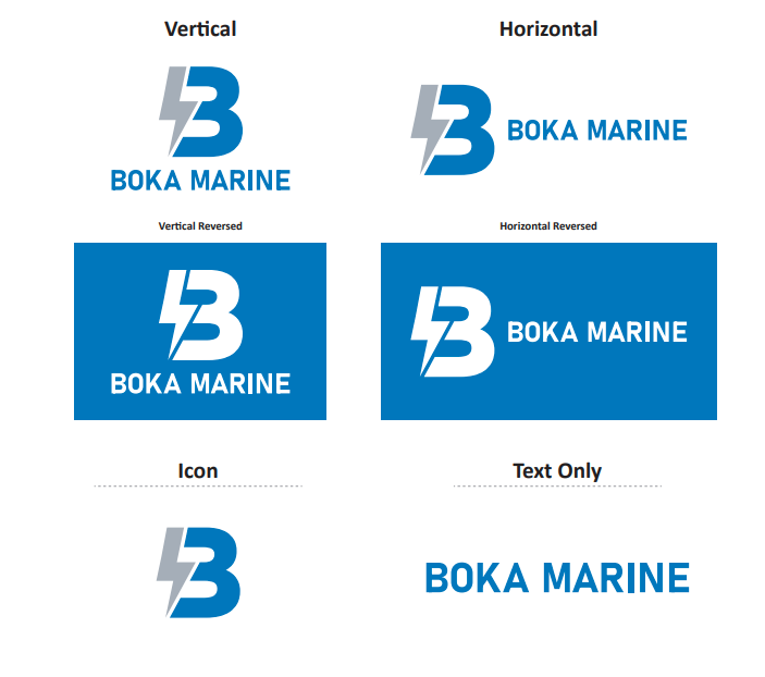
Boka Marine
Boka Marine’s logo captures the essence of their innovative electric-powered personal pontoon boats. The design features a lightning bolt integrated into the “B,” symbolizing the boat’s electric propulsion, while the other side of the “B” evokes waves, representing the marine environment. This sleek and modern logo embodies the harmony between sustainable technology and aquatic adventure, perfectly aligning with Boka Marine’s mission to redefine personal watercraft experiences.
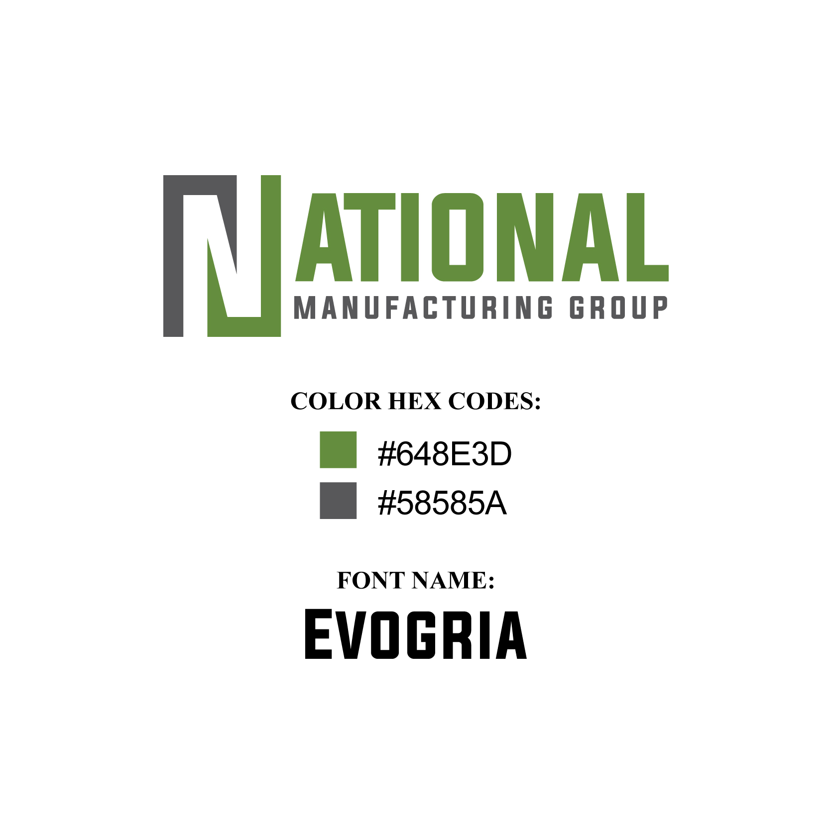
National Manufacturing Group
Formerly known as National Composites, National Manufacturing Group—commonly referred to as “National”—carries forward the legacy of its predecessor with a refreshed identity that emphasizes its broader capabilities. The logo retains the recognizable color palette and font style, ensuring continuity for existing customers while signaling growth and evolution. The prominent “N” mark provides quick and easy identification, bridging familiarity with a modern look that highlights National’s expansion beyond composites into a leader in manufacturing innovation.
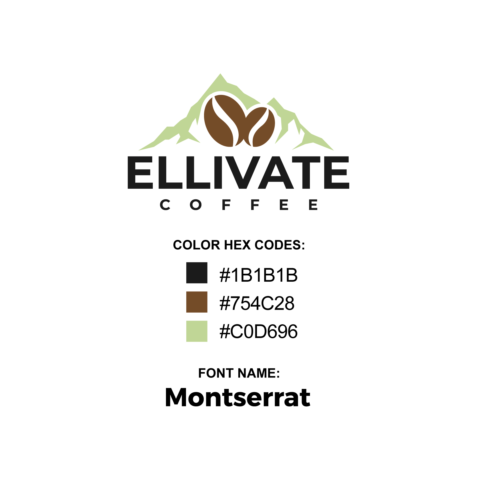
Ellivate Coffee
Owned and distributed by Ellison Brewing from East Lansing, Michigan, Ellivate Coffee combines a passion for quality with a commitment to sustainability. The coffee beans are sourced directly through fair trade from Colombia, ensuring ethical practices while delivering a rich, authentic flavor. The logo highlights this connection, with coffee bean imagery nestled within mountain peaks, symbolizing both the origins of the beans and the elevated experience Ellivate Coffee offers to every customer.
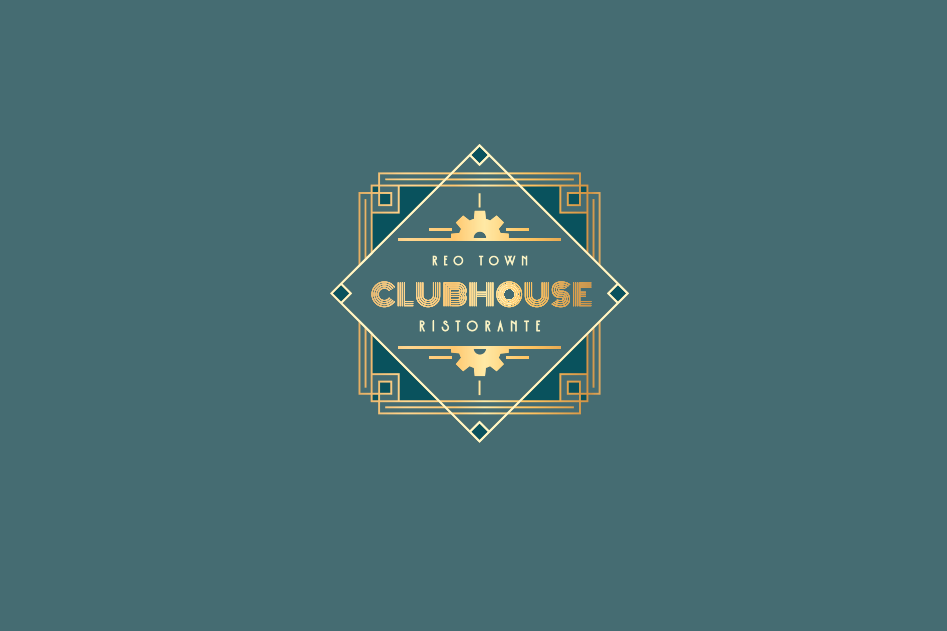
Reo Town Clubhouse
The Reo Town Clubhouse logo perfectly embodies the client’s vision of a roaring 1920s art deco aesthetic. The bold, geometric design and rich color palette evoke a sense of timeless elegance while paying homage to Reo Town’s storied history. The centerpiece gear symbolizes the area’s industrial roots, while the overall design reflects a commitment to quality and craftsmanship reminiscent of an era when house-made food set the standard. This logo is a celebration of both community and culinary artistry.
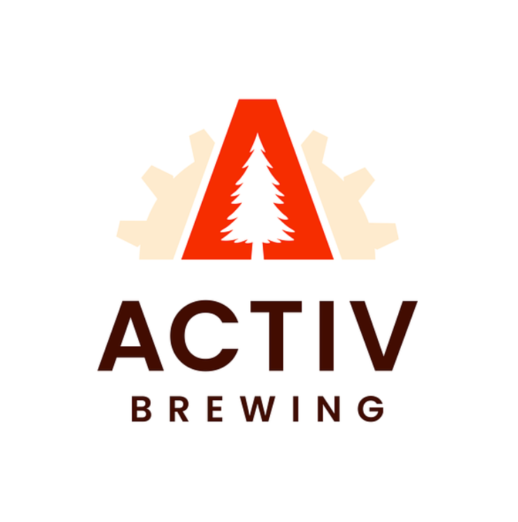
Activ Brewing
A brand extension of Ellison Brewing, Activ Brewing embodies a commitment to health-conscious, active lifestyles with its non-alcoholic beer offerings. The logo features Ellison’s signature gear, reimagined with a triangular “A” shape, housing an evergreen tree at its center—a nod to outdoor adventures and vitality. The clean design reflects the brand’s promise of a crisp, refreshing, and classic beer taste that complements an active, health-focused lifestyle.
DeWitt Soccer Club
The DSC logo creatively blends tradition with individuality. Inspired by the school district’s Panther mascot and color scheme, the design takes a fresh approach to represent the club’s unique identity. A dynamic Panther figure anchors the design, subtly distinct from the school’s mascot, while the soccer ball beneath the bold “DeWitt SC” ribbon ties the logo back to the sport. This emblem captures the spirit of community and competition, perfectly symbolizing the club’s pride and passion for soccer.
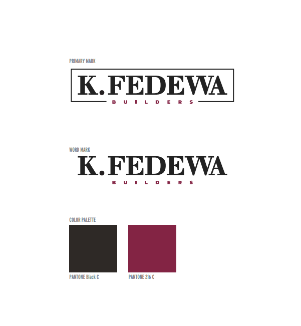
Fedewa Builders
The Fedewa Builders logo is a timeless and classic design that exudes trust and dependability. Featuring clean lines and a sophisticated color palette, the logo reflects the company’s commitment to quality craftsmanship and enduring relationships. Its simplicity and elegance convey a sense of professionalism and reliability, making it a symbol of confidence for clients and partners alike.
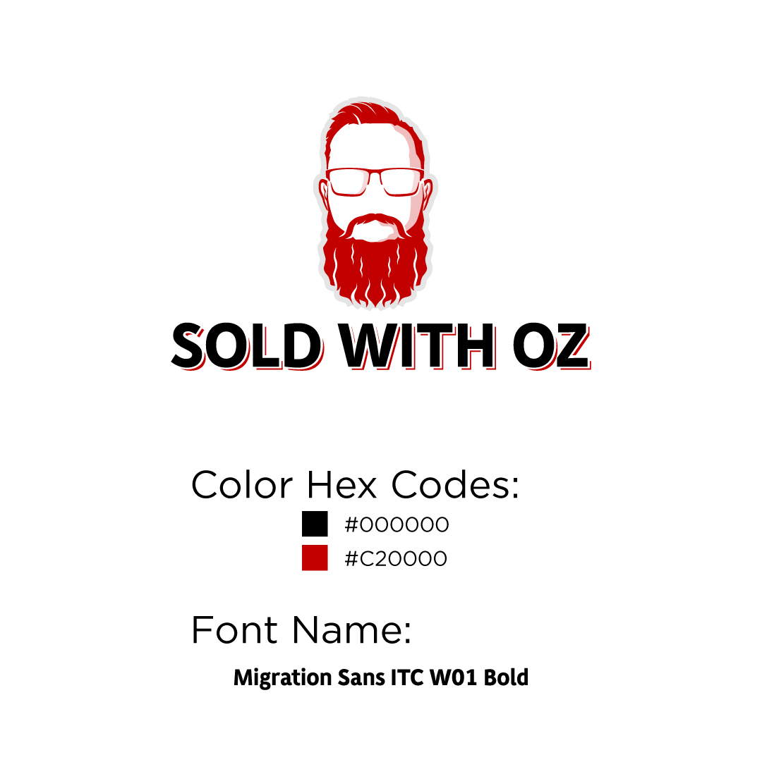
Sold With Oz
The Sold With Oz logo captures the personal brand of Brian Ozburn, a prominent Lansing-area realtor. Known for his signature beard, the logo features a bold silhouette of his head and beard, creating a distinctive and memorable mark. The clean and modern design emphasizes individuality and approachability, aligning perfectly with Brian’s professional yet personable approach to real estate.
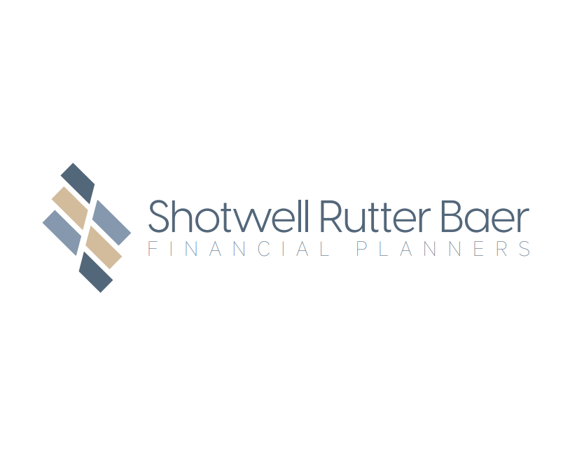
Shotwell Rutter Baer
The Shotwell Rutter Baer logo is a refined and conservative design, reflecting the firm’s timeless commitment to trust and professionalism in financial advising. The six marks within the logo symbolize the core principles of their practice: integrity, fiduciary responsibility, strategic planning, community advocacy, personalized service, and forward-thinking innovation. With a clean and understated aesthetic, the logo aligns perfectly with the firm’s mission to provide ethical and client-centered financial planning.
The Frederick Group
The Frederick Group logo is a clean and professional design that incorporates a silhouette of Michigan’s iconic Capitol building, symbolizing the firm’s deep roots in Lansing’s government relations landscape. The red, white, and blue color palette reflects the organization’s dedication to American governance and its commitment to representing clients with integrity. This timeless design aligns with The Frederick Group’s mission to act as trusted advocates and facilitators, promoting their clients’ best interests through effective communication and policy-driven strategies.